Key Highlights
Here are the key takeaways for 2025's exterior paint trends:
- The most popular exterior paint color trends for 2025 lean into warmth, nature, and longevity.
- Earthy tones like sage green, rich brown, and terracotta are popular for creating a connection to the outdoors.
- Classic shades like creamy whites and deep charcoals continue to offer timeless curb appeal.
- Choosing the perfect shade for your home exterior involves considering your home’s architecture, lighting, and surroundings.
- Always test paint samples on your home before committing to a full exterior paint job.
- The right color palette can dramatically transform your home’s curb appeal and reflect your personal taste.
Introduction
Are you thinking about giving your home a fresh look? Choosing the right exterior paint color is one of the most impactful decisions you can make to boost your home's curb appeal. With so many options available, the process can feel overwhelming. Exploring current design trends is a great way to find inspiration and discover styles that resonate with you. This guide will walk you through the most popular exterior paint colors for 2025, helping you feel confident as you begin your painting project.
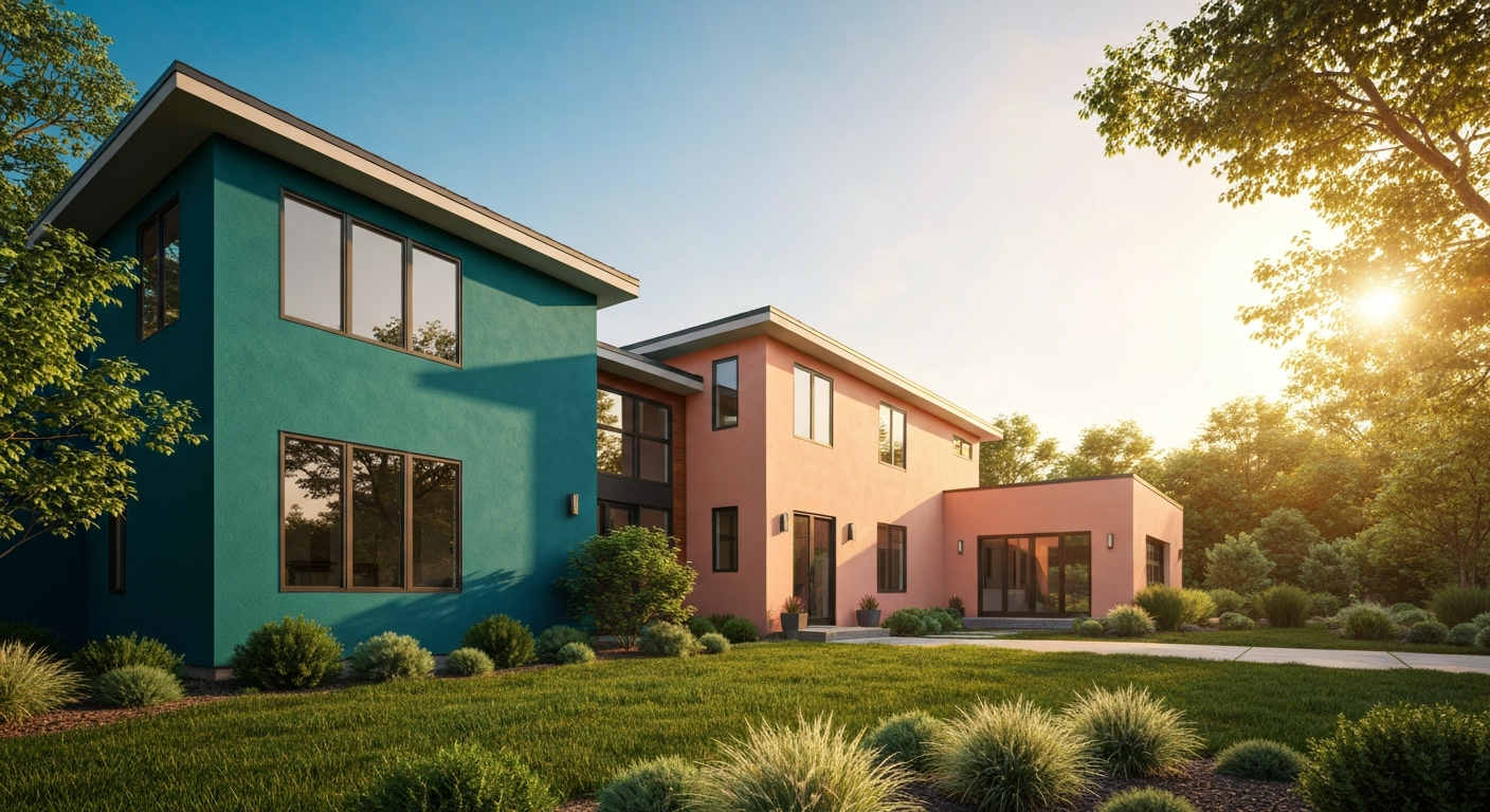
Transform Your Home with 2025 Exterior House Colors Ideas
Choosing an exterior paint color is your chance to make a statement and enhance your home’s curb appeal. The color palette you select can highlight architectural details and set the tone for your entire property. Whether you’re drawn to the color of the year or prefer timeless shades, the goal is to find the perfect color that complements your home exterior.
With so many popular exterior paint colors emerging, you have endless opportunities to refresh your home. From warm neutrals to bold, dramatic hues, these color schemes are designed to harmonize with various exterior elements. Let's explore the top ideas for your 2025 exterior paint job.
1. Warm Earthy Neutrals for Welcoming Exteriors
Warm, earthy tones are a top trend for 2025, bringing a cozy and inviting feel to home exteriors. Shades like beige, cinnamon, and terracotta are perfectly in step with nature-inspired hues. These warm neutrals not only complement the natural surroundings but also add a welcoming warmth to your facade. A popular choice in this category is Accessible Beige, known for its unique gray undertones that provide a modern yet snug appearance.
These earthy tones are incredibly versatile and pair beautifully with existing features like stone, wood, and greenery. They also have a practical advantage, as their warm composition helps mask dust and dirt, keeping your home looking fresh. An exterior paint color in a warm neutral adds dimension and character, especially to homes that might otherwise feel flat or too cool.
Why choose warm earthy neutrals?
- They create a strong connection to the natural landscape.
- They add warmth and character to your home's exterior.
- They pair seamlessly with stone, wood, and brick accents, boosting curb appeal.
2. Serene Sage Green for a Natural Vibe
Leading the way in 2025 is the rise of earthy greens, with serene sage green at the forefront. This soft, adaptable shade brings a sense of calm and a deep connection to nature. Sage green is a muted tone that pairs effortlessly with crisp white trim and warm wood details, enhancing architectural styles from classic craftsman homes to cozy cottages. Its understated elegance makes it one of the most popular choices for homeowners.
Whether your home is nestled in a wooded landscape or situated in a more urban environment, sage green offers a timeless and welcoming presence. It strikes a perfect balance between being a subtle background and a character-filled color. This shade enhances natural materials like brick and stone, making it a versatile option for any color palette.
Using sage green for your home's exterior creates an inviting atmosphere that feels both fresh and grounded. It’s a color that feels restorative and peaceful, helping your home blend beautifully with its natural surroundings while still standing out with a touch of sophisticated color.
3. Coastal Blues for Refreshing Curb Appeal
Shades of blue are emerging as a standout choice for home exteriors, offering timeless appeal and the ability to add depth and personality. Often associated with peace and tranquility, coastal blues work beautifully alongside warm stone or natural wood accents. Light, breezy blues are perfect for creating a cheerful, uplifting look, especially for coastal or suburban homes. When used as the main body color, these cool tones feel fresh and clean.
For a classic look, pair these blues with crisp white trim. If you want more contrast and visual interest, incorporating warm wood elements like a pergola or cedar details can add richness and dimension. The versatility of coastal blues allows you to create a color palette that feels both refreshing and sophisticated, ensuring a perfect balance.
Why choose coastal blues?
- They evoke a sense of calm and tranquility.
- They offer exceptional versatility, pairing well with white trim and wood accents.
- They bring a refreshing and cheerful vibe, instantly boosting curb appeal.
4. Classic Creamy Whites for Timeless Charm
It’s no surprise that white remains a top contender for exterior color trends in 2025. A timeless classic, creamy whites like White Dove and Swiss Coffee offer a clean look and unmatched versatility. These shades complement a wide range of architectural styles, from modern farmhouses to coastal retreats. Their timeless appeal makes them a safe yet stylish choice for any body color.
Unlike stark, bright whites, creamy whites have soft undertones that create a warm and inviting glow. A shade like Swiss Coffee has subtle yellow undertones, giving it a cozy, vintage-inspired charm. This warmth is perfect for adding character and curb appeal to your home's exterior. Using a crisp white trim with a creamy white body can highlight architectural features beautifully.
A white exterior also provides a blank canvas, allowing you to personalize your home with bold accent colors, statement fixtures, and curated landscaping. This flexibility ensures your home will look stylish for years to come.
5. Rich Chocolate Browns for Modern Sophistication
For years, black was the go-to for a bold exterior, but in 2025, rich chocolate brown tones are taking center stage. Shades like Sherwin-Williams' Urbane Bronze are redefining dramatic exteriors with their warmth, depth, and timeless appeal. This earthy hue is incredibly versatile, suiting everything from modern homes to rustic barndominiums.
The warmth of chocolate brown makes it less stark than black while still providing a sophisticated and modern look. It pairs exceptionally well with natural wood accents, stone features, and warm white trim, which helps soften and highlight your home’s architectural style. This trend proves that dark colors can feel inviting and organic.
As one of the most popular exterior paint colors for those seeking a dramatic yet grounded look, rich brown offers a fresh alternative. It creates a powerful statement that feels both contemporary and connected to nature, making it perfect for homeowners looking to stand out.
6. Bold Charcoal and Slate Accents
Bold, elegant, and undeniably striking, charcoal gray and slate accents are making a powerful statement in exterior paint trends. This daring hue adds instant sophistication to modern exteriors and reflects a shift toward bolder design choices. A deep color like Sherwin-Williams' Iron Ore can create a dramatic yet tasteful backdrop for lush landscaping and highlight architectural details.
Charcoal gray pairs beautifully with natural materials like wood, stone, and brick. It works equally well as a primary color or as an accent color for trim, shutters, or doors. When used for accents, it provides a striking contrast against lighter body colors. This versatility extends to traditional architecture, where it can be elevated with refined details like copper gutters or brass light fixtures.
Why use charcoal and slate?
- They create a bold, high-contrast look that feels modern and sophisticated.
- They are surprisingly versatile, complementing both contemporary and traditional homes.
- They pair well with natural materials and light trim for a balanced design.
7. Sun-Kissed Terracotta and Clay Tones
Embrace the warmth of the sun with terracotta and clay tones for your home's exterior. These earthy hues are making a major comeback, infusing homes with charm and character. As part of the larger trend toward earth tones, terracotta provides a vibrant yet grounded look that connects your home to its natural surroundings. It’s an ideal choice for Mediterranean, Southwestern, or rustic architectural styles.
These sun-kissed shades pair beautifully with creamy off-whites, deep browns, and natural wood exterior elements. Imagine terracotta walls complemented by rich, dark wood trim or a clay-colored front door that pops against a neutral background. This color family adds a layer of texture and warmth that few other shades can match.
Choosing terracotta or clay tones is a wonderful way to boost your home’s curb appeal with a color that feels both unique and timeless. It’s a perfect way to make a statement that is simultaneously bold and welcoming.
8. Inviting Olive and Moss Greens
Deeper into the family of earthy greens, inviting olive and moss green shades offer a rich, organic feel for home exteriors. These colors are slightly moodier than sage but just as connected to the natural surroundings. Olive green, in particular, provides a sense of sophisticated calm, reminiscent of Mediterranean landscapes. It’s a perfect color for homeowners who want an earthy yet refined look.
These greens work wonderfully on a variety of home styles, from historic properties to modern builds. They create a harmonious backdrop for gardens and landscaping, allowing your greenery to truly pop. Pair them with warm beige trim or dark wood accents to complete the nature-inspired palette.
Why choose olive and moss greens?
- They offer a sophisticated, organic feel that connects your home to nature.
- They pair beautifully with warm neutrals and natural wood tones.
9. Tranquil Grays for Contemporary Homes
Tranquil grays continue to be a popular choice for contemporary homes due to their versatility and calming presence. A true greige like Benjamin Moore's Revere Pewter, which blends gray and beige, offers a classic, restorative feel. It leans slightly warm and can shift its appearance depending on the lighting, sometimes appearing more gray and at other times more beige. This adaptability makes it a go-to neutral.
For a slightly cooler but equally versatile option, a light gray like Agreeable Gray works well as a body color for modern homes. These grays pair crisply with white trim and provide a clean backdrop for bold accent colors on the front door or shutters. They are the foundation of a sophisticated and balanced color palette.
Choosing a tranquil gray for your exterior allows for flexibility in your design. It can support a minimalist aesthetic or serve as a neutral base for more eclectic and colorful accents, making it a reliable choice for any contemporary home.
10. Statement-Making Black Exteriors
For a truly dramatic and modern look, statement-making black exteriors are a bold color choice that commands attention. While not for the faint of heart, a black or near-black home can be incredibly chic and sophisticated. This color works especially well on homes with strong, clean lines and minimalist architectural style, as it emphasizes the structure's form.
To avoid a look that’s too severe, balance a black exterior with warm wood accents, lush greenery, and plenty of exterior lighting. A striking contrast can be achieved by using a crisp white or a light neutral for the trim. Black also makes an excellent accent color for doors, shutters, and window frames on a lighter-colored home.
Why consider a black exterior?
- It creates a bold, modern, and highly sophisticated statement.
- It provides a striking contrast with natural elements and lighter accent colors.
11. Muted Lavender and Soft Mauve Highlights
For those looking to add a touch of uniqueness and personality, muted lavender and soft mauve are emerging as beautiful highlight colors. While not a common choice for a home's entire body, these shades are perfect as an accent color for front doors, shutters, or even porch ceilings. They offer a hint of color that is both gentle and unexpected.
A soft mauve can bring warmth and charm to a traditional home with a gray or white exterior, while a muted lavender can add a whimsical touch to a cottage-style house. These colors are part of a growing trend toward personalization in home design, allowing you to express your individual style in a subtle yet impactful way.
When building your color palette, consider these gentle purples to add a creative flair. Paired with neutral siding, a lavender front door can become a beautiful focal point for your home exterior, welcoming guests with a touch of elegance.
12. Vibrant Yellows for Standout Curb Appeal
Nothing says "welcome" quite like a cheerful, vibrant yellow. While using it as a main body color can be a bold move, a splash of yellow on the front door or shutters is a fantastic way to create standout curb appeal. This sunny hue instantly draws the eye and creates a friendly, optimistic first impression. It’s one of the most popular choices for homeowners looking to make a memorable statement.
Vibrant yellow pairs wonderfully with a variety of exterior paint color schemes, including cool grays, deep blues, and classic whites. The contrast makes the yellow pop, turning an ordinary entryway into a stunning focal point. It's an easy and effective way to inject personality into your home’s facade.
Why use vibrant yellow?
- It creates a cheerful and welcoming focal point.
- It pairs well with popular neutral body colors like gray, blue, and white.
13. Deep Navy Blues for a Nautical Look
For a look that is both classic and commanding, deep navy blue is an excellent exterior paint color. A rich, saturated shade like Benjamin Moore's Hale Navy evokes the elegance of maritime tradition while offering modern versatility. This color is perfect for creating a nautical look, especially for homes near the water or for anyone who loves a timeless, sophisticated aesthetic.
A navy blue home exterior pairs sharply with a bright white trim, creating a clean, crisp contrast that highlights architectural details. To add warmth and prevent the color from feeling too cold, incorporate natural wood accents on porches, doors, or columns. This creates a balanced and inviting color palette.
Whether used as the main color or as a strong accent, deep navy blue delivers depth and character. It’s a color that stands the test of time, proving that a classic choice can also be a bold one for your home exterior.
14. Dusty Rose and Blush Accents
Adding a touch of romance and warmth, dusty rose and blush tones are gaining popularity as accent colors. These soft, muted pinks offer a sophisticated alternative to brighter accent shades. They are particularly effective on traditional homes, where they can bring out the charm of a white, cream, or light gray exterior.
Imagine a dusty rose front door on a classic white house or blush-colored shutters against a soft gray siding. These accents add a subtle layer of color that feels warm, inviting, and unique. They allow you to add personality to your home without overwhelming the overall design.
When building your color palette, consider these gentle shades to create a soft, welcoming entryway. A dusty rose or blush accent is a stylish way to add a bit of understated elegance and make your home stand out in a tasteful way.
15. Cool Aqua and Teal Inspirations
For a fresh and energetic vibe, look to cool aqua and teal for inspiration. These vibrant, water-inspired hues are perfect for adding a splash of personality to your home's exterior. While you might not paint your entire house in these shades, they make for a stunning accent color on front doors, trim, or outdoor furniture, especially for coastal or contemporary homes.
These cool tones pair beautifully with crisp white, light gray, or even sandy beige siding, creating a color palette that feels like a permanent vacation. An aqua front door, for example, can be a refreshing focal point that hints at a fun and relaxed interior.
Choosing an aqua or teal exterior paint color for accents is a great way to update your home with a modern touch. These shades are cheerful and stylish, offering a unique way to express your personal taste and boost your home's curb appeal.
Designer Tips for Choosing the Right 2025 Exterior Paint Colors
Selecting the perfect shade for your home involves more than just picking a trendy color. A successful exterior paint job requires careful consideration of your home's unique characteristics. From assessing lighting to testing paint samples, a few key steps can ensure you find an exterior paint color that you'll love for years.
To make the right choice, you'll want to think about your home's architectural details, its natural surroundings, and how different hues look throughout the day. Below are some expert tips to guide you in choosing the right body color and accents for your exterior painting project.
Assess Lighting and Surrounding Landscape
One of the most important factors in choosing an exterior color is understanding how it will look in natural light. A paint color can appear dramatically different in the morning sun compared to the shade of an overcast afternoon. The direction your home faces also plays a significant role in how a color is perceived throughout the day.
Before making a final decision, observe how your potential color choices look in different lighting conditions. Take cues from your home's natural surroundings as well. A color palette inspired by your landscape—whether it's lush greenery, a rocky desert, or a blue coastline—will create a harmonious and cohesive look.
Tips for this step:
- Test paint samples on different sides of your house to see how the color changes with the light.
- Choose colors that complement your landscaping, stonework, and other fixed elements.
Factor in Architectural Style and Materials
Your home’s architectural style should heavily influence your exterior paint choices. Certain color palettes naturally complement specific designs. For example, earthy greens and deep reds are a hallmark of classic Craftsman homes, while bold charcoals and clean whites emphasize the lines of contemporary homes. Ignoring your home's style can create a disjointed look.
Similarly, consider the existing materials on your home exterior. Your roof color, brick or stone accents, and window frame colors are all fixed elements that your new paint color needs to harmonize with. The goal is to create a cohesive look where the paint enhances, rather than clashes with, these features.
Key considerations include:
- Researching color schemes traditionally associated with your home’s architectural style.
- Selecting a paint color that coordinates with your roof, brick, and any stonework.
Test Color Samples Before Committing
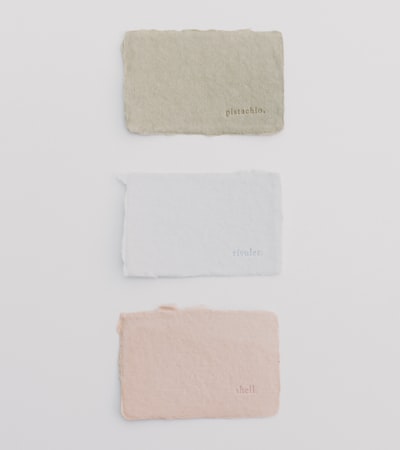
Never commit to a color based on a small paint chip alone. It is crucial to test paint samples directly on your home's exterior. Most paint brands offer sample pots or large peel-and-stick swatches that make this process easy. Apply the samples to a few different areas of your house, such as a spot that gets direct sun and another that's mostly in shade.
Observe the test paint samples at various times of the day—morning, noon, and evening—to see how they look in different lighting conditions. This step is the best way to get a true feel for how the final paint job will look and can save you from a costly mistake.
Why you should always test:
- A color can look vastly different on a large surface than it does on a tiny chip.
- Testing allows you to see how the color interacts with your home’s lighting and materials before you commit.
Mix Classic and Trendy Shades for a Balanced Look
A great way to create a stylish yet timeless exterior is to strike a perfect balance between classic and trendy shades. Instead of painting your entire house in the latest color craze, consider using a timeless neutral for the body of the house and introducing a trendy color as an accent. This approach ensures your home won't look dated once exterior paint trends shift.
For example, you could pair a classic creamy white or a versatile greige siding with a bold, on-trend front door in a rich brown or deep green. This creates a balanced look that has both longevity and personality. This method allows you to update your home's look easily by simply repainting the accents every few years.
How to achieve a balanced color palette:
- Choose a timeless, neutral color for the main body of your house.
- Use a trendier, bolder shade for accents like the front door or shutters.
Popular Paint Brands and Their Top 2025 Exterior Colors
When it comes to exterior paint, leading brands like Sherwin-Williams, Benjamin Moore, and Behr are trusted for their quality and extensive color selections. Each year, these popular paint brands highlight specific shades, including a color of the year, that reflect current design trends. Their 2025 exterior paint colors focus on durability, beauty, and a connection to nature, offering everything from warm neutrals to deep, dramatic hues. These curated picks provide excellent inspiration for your project and are formulated to provide a durable finish.
Here are some of the most popular exterior colors from top paint brands for 2025:
- Paint Brand: Sherwin-Williams
Popular 2025 Exterior Color: Urbane Bronze
Description: A rich greige with warm undertones of brown and bronze. - Paint Brand: Benjamin Moore
Popular 2025 Exterior Color: Hale Navy
Description: A deeply saturated, classic navy blue with timeless appeal. - Paint Brand: Behr
Popular 2025 Exterior Color: (Implied Trend)
Description: Earthy greens and warm neutrals that connect the home to nature.
Sherwin-Williams, Benjamin Moore, and Behr Color Picks
The most popular paint brands have curated their top exterior colors for 2025, making it easier than ever to find a stunning shade. Sherwin-Williams continues to champion colors like Urbane Bronze, a rich and warm greige, and Illusive Green, a contemplative green with subtle gray undertones. Another favorite, Accessible Beige, offers a cozy warmth perfect for a welcoming exterior.
From Benjamin Moore, timeless classics like Hale Navy, a deep and sophisticated blue, and Revere Pewter, a perfect greige, remain go-to choices. The brand's creamy whites, such as Swiss Coffee and White Dove, are also among the most popular exterior colors for their clean and versatile appeal. These shades are known for their ability to complement a wide range of architectural styles.
While specific Behr colors weren't detailed, the trends point toward their extensive collection of earthy greens, warm neutrals, and coastal blues. When planning your paint job, exploring the color of the year and other top picks from these trusted brands is a great starting point.
Conclusion
In conclusion, transforming your home with the right exterior paint colors can significantly enhance its curb appeal and reflect your personal style. As we look ahead to 2025, embracing warm earthy neutrals, serene greens, and vibrant yellows can create inviting and stunning exteriors. Remember to consider your home’s architectural style and the surrounding landscape when selecting colors. Testing samples will ensure you make a choice you’ll love for years to come. If you're looking to explore unique color options tailored to your home, don’t hesitate to reach out for a free consultation with our design experts. Let’s make your dream home a reality!
Frequently Asked Questions
What exterior color trends are best for curb appeal in 2025?
For the best curb appeal in 2025, focus on exterior paint trends that feel both modern and timeless. The most popular options include warm, earthy tones like sage green and terracotta, sophisticated deep charcoals, and classic creamy whites. Choosing the perfect color from this palette will create a welcoming and stylish first impression.
How do I select the ideal exterior color for my home’s style in 2025?
To select the ideal exterior paint color, consider your home's architectural style and natural surroundings. Draw inspiration from popular choices, but always test paint samples on your home to see how they look in different lights. This ensures the final color complements your home's style and fixed elements perfectly.
Are there any new or unique exterior paint colors designers recommend for 2025?
Yes, designers are recommending unique accent colors to add personality. Alongside the earthy color of the year trends, consider using shades like muted lavender, dusty rose, or soft mauve for front doors or shutters. These unexpected hues offer a sophisticated and personalized way to find the perfect shade for your exterior paint project.